

The Problem
I know so many hugely talented creative people who really struggle with executive function. They struggle to get tasks started due to time blindness, lack of structure and task overwhelm, which can often lead to procrastination and missed deadlines. Across my projects, I focus on reducing friction, simplifying decisions and designing systems that support real human behaviour - The Procrastination-Nation pushed me to consider what I'd need to put in place for neurodivergent users.
I was particularly interested in the link between ADHD and creatives (sometimes more of a circle than a Venn diagram!) and wanted to design a productivity software which would work for them in a neuro-inclusive way! Different brains work in different ways, and I believe software should always be addressing accessibility concerns. My main goals were to combat the motivation spikes and crashes experienced by individuals with ADHD, as well as simplifying the user flows to promote ease of use.
My Design Process
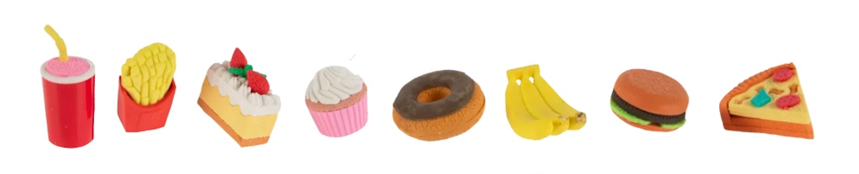
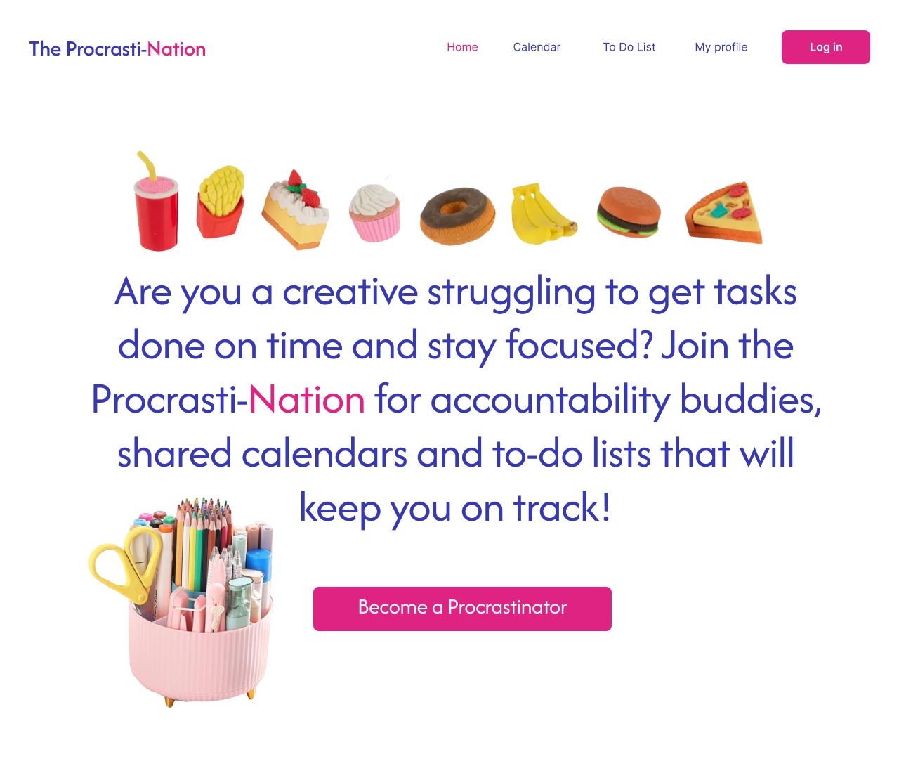
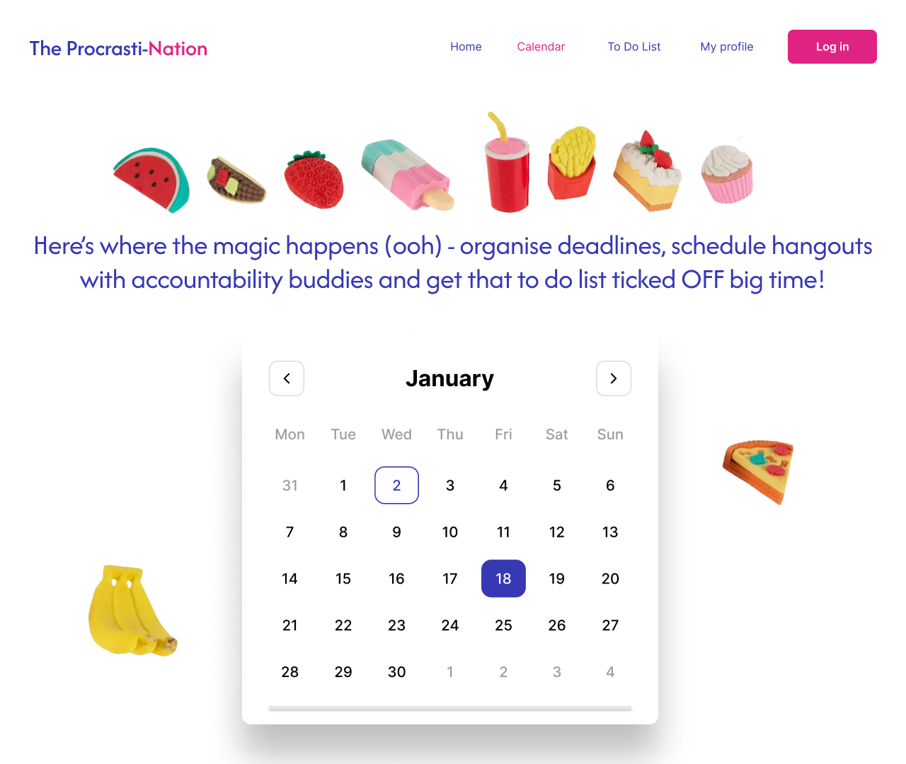
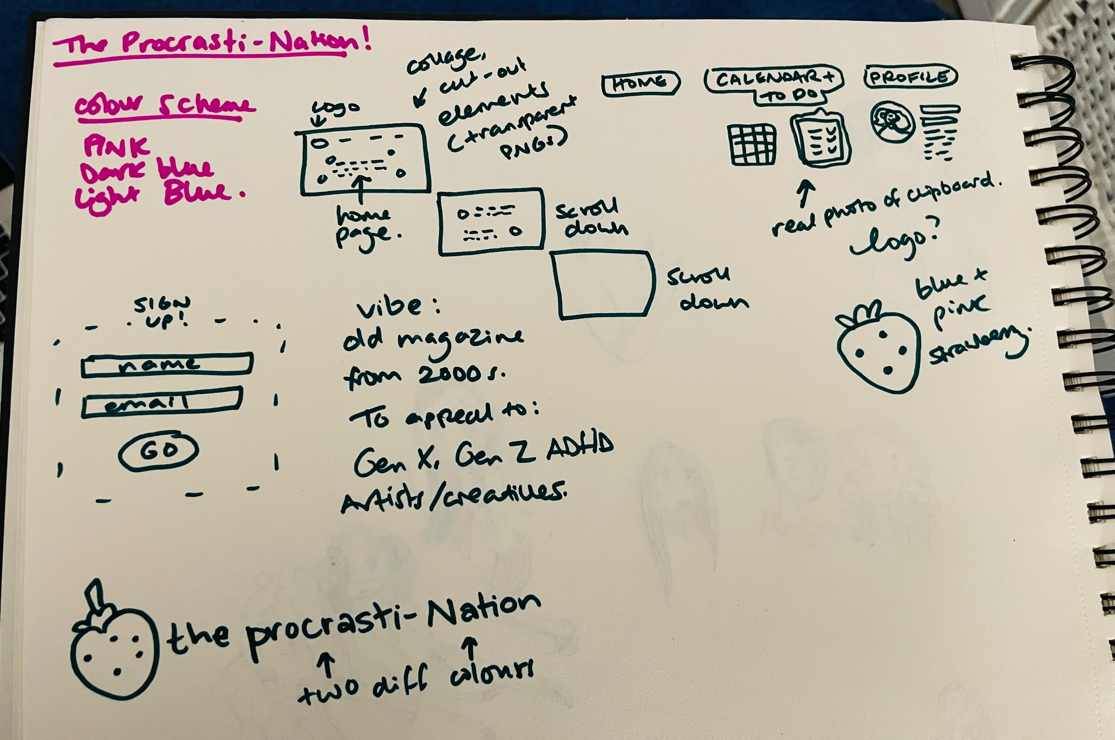
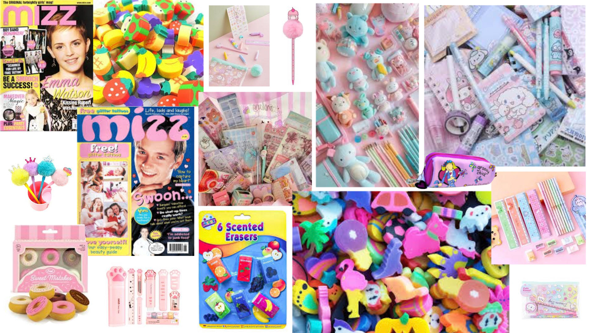
I wanted to create peak nostalgia from the noughties, with almost a scrapbook feeling, hence the novelty eraser theme! I wanted the design to be clean, accessible and usable, but also fun and colourful, and feature instantly recognisable stationery from my users' childhood (hello, novelty pom pom pens!). I intended my designs to reduce cognitive load, guiding my users gently towards increasing their productivity without overwhelming them.
I conducted interviews with a panel of illustrators, some of whom have diagnoses of ADHD, who advised me on my choice of website copy, the user interface and how to best optimise the site for their purposes. They mentioned intentionality as being important - software that told them clearly what to do next - and highlighted that they often found starting a project to be the most challenging part of the process.
Because of the ADHD tendency to feel overwhelmed by too many options, I wanted to keep my site simple, with appealing branding that they'd want to keep coming back to again and again. I used clear fonts, intentional CTA, bright colours and whimsical, recognisable cut-out imagery to maximise nostalgia while remaining easy to navigate.


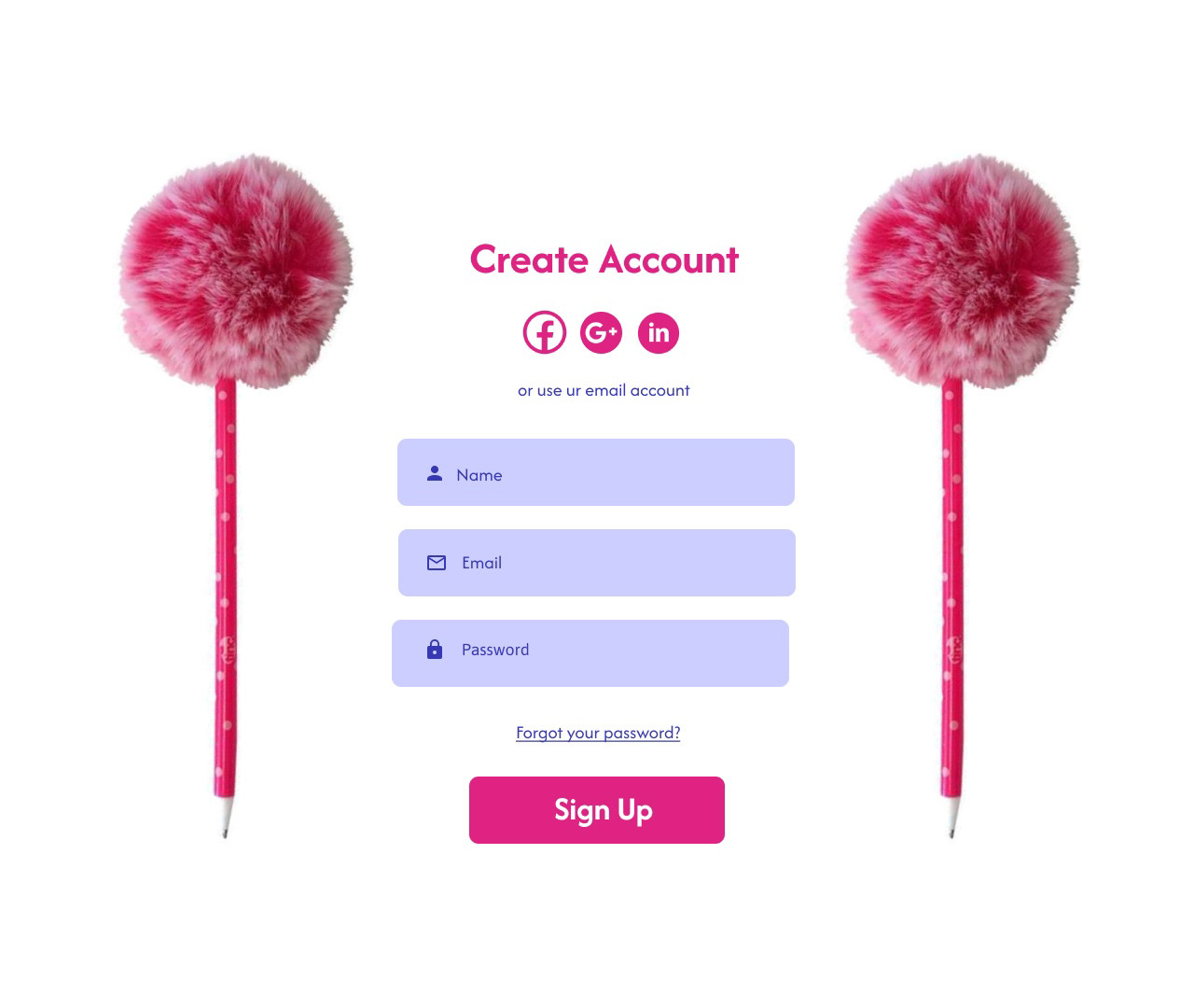
Create Account

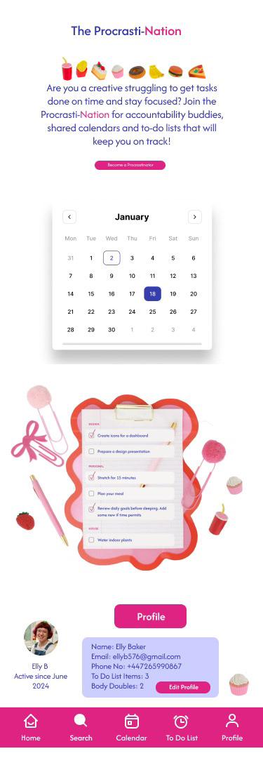
Mobile Interface
Design Strategy and Vision - What Worked? What Didn't?
As you can see from my sketches, the strawberry motif didn't make the cut, as I found the plain text to be visually striking enough to work for my branding vision! My initial website copy also featured the words 'executive dysfunction', which was flagged as being too overly complex and bringing to mind the phrase 'erectile dysfunction', which I didn't want for obvious reasons. I also changed initial CTA buttons, removing the 'basket' function as I had been modelling my navigation bar on an online shop's one!
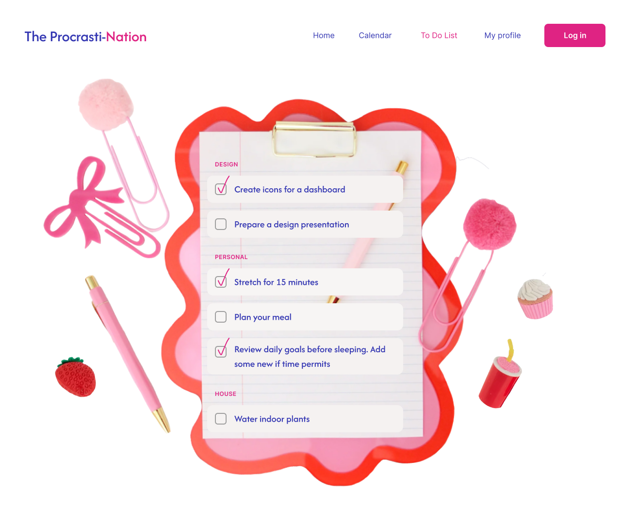
I simplified my text right down, while maintaining a friendly, conversational tone. Users also commented that they would be most likely to use this software on a phone, so I had to find a way for the design to be multi-purpose across numerous devices. A key decision that came up in each iteration was to simplify, since adding too many pictures made the design feel crowded, and made the pictures feel less of a novelty.
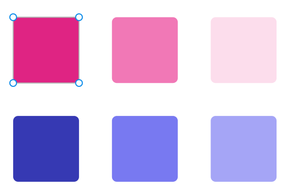
I chose these key colours because I felt they'd be both fun and clean on a white background, with the bold contrast between the two halves of the word being my main focus for the branding. As I knew I would be largely catering to a female audience, I chose pink as a prominent featured colour here. Check out some of my sketches, palettes and mood boards!
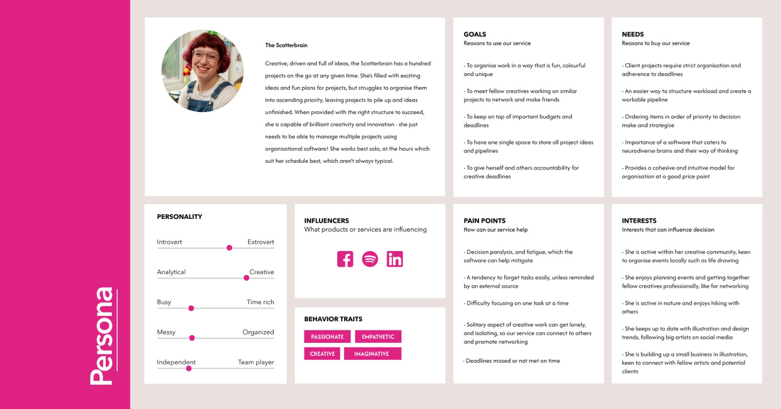
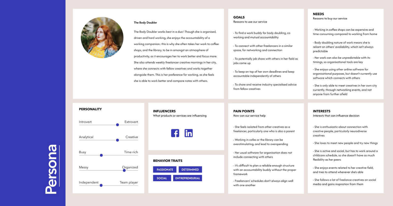
User Personas
I also created a series of user personas to represent what my target audience might be for this service, what their pain points might be and what The Procrasti-Nation might be able to bring to them in terms of increased productivity, as well as networking and connecting with other artists socially.
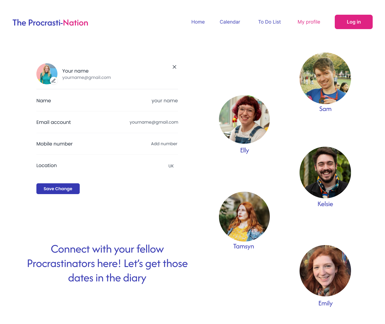
For creatives like illustrators and animators, freelance work can sometimes be isolating, its structure often inconsistent by design. I wanted my software to allow for artists in similar sectors to meet and connect with one another, sharing their experiences and fostering long term friendships, either through mutual accountability (body doubling) or just for plain old social networking!
Feedback and Results
I found that my users reported increased productivity, as well as improved engagement with one another as a result; they were able to cohesively organise projects in a way that was also fun, and motivate one another to action their project deliverables. They also enjoyed the whimsical user interface, commenting that it reminded them of scrapbooking as kids, bringing an approachability to the software.
It was important to me that my designs feel friendly and human in tone, allowing my users to complete one task at a time to avoid overwhelm. I used certain language informalities and cute imagery, such as the pens and stationery, to drive home the nostalgic, childlike feeling, as well as stand out from other similar productivity softwares my demographic might be considering.