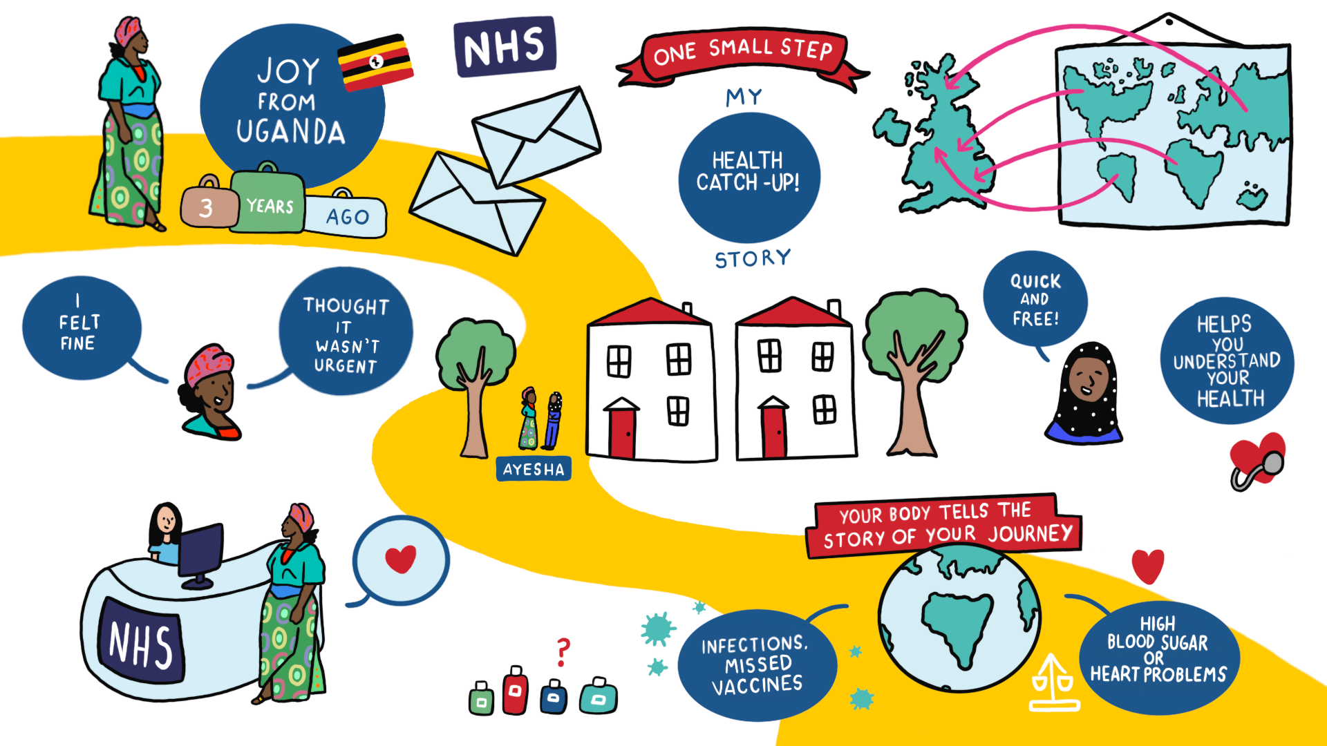
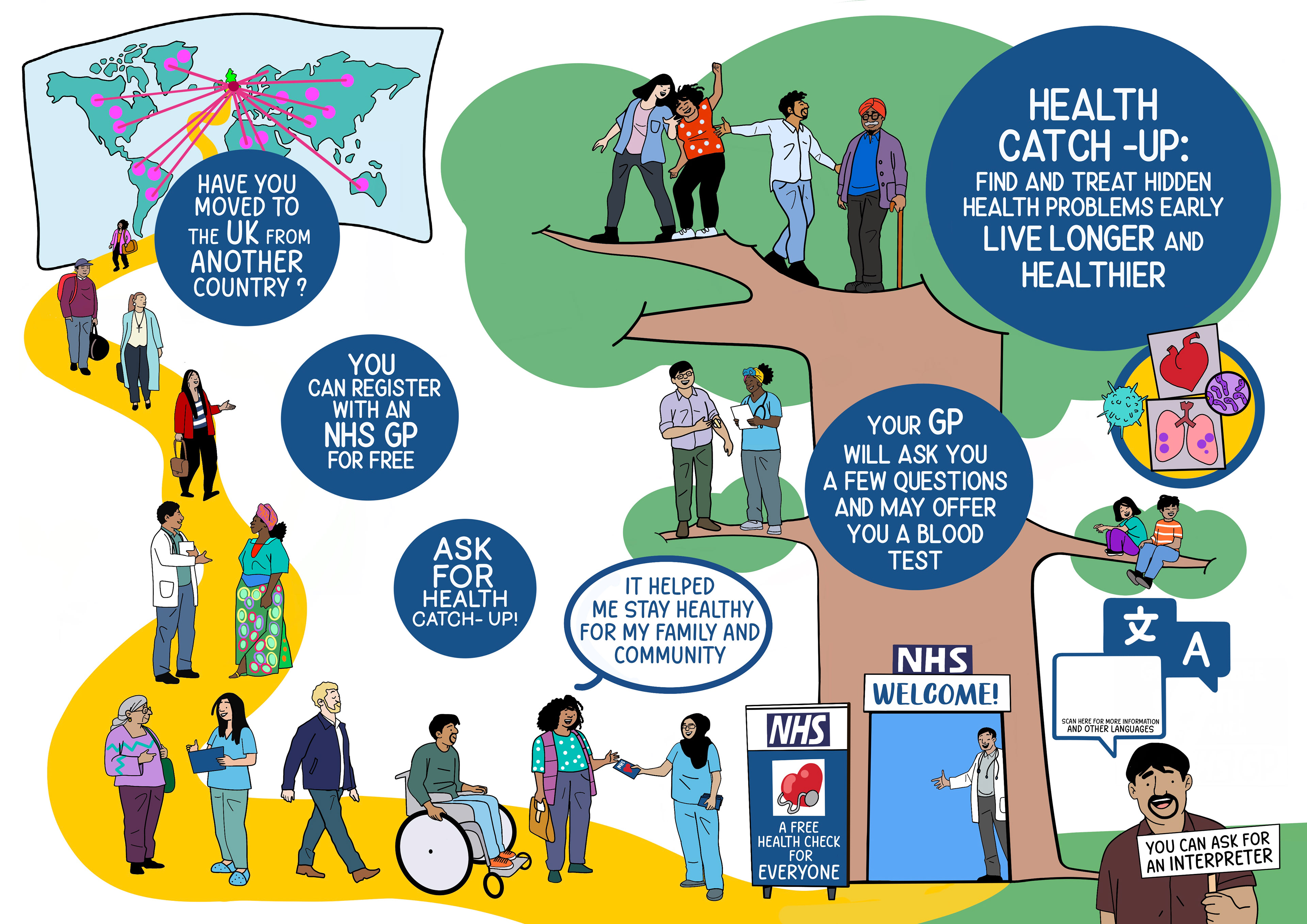
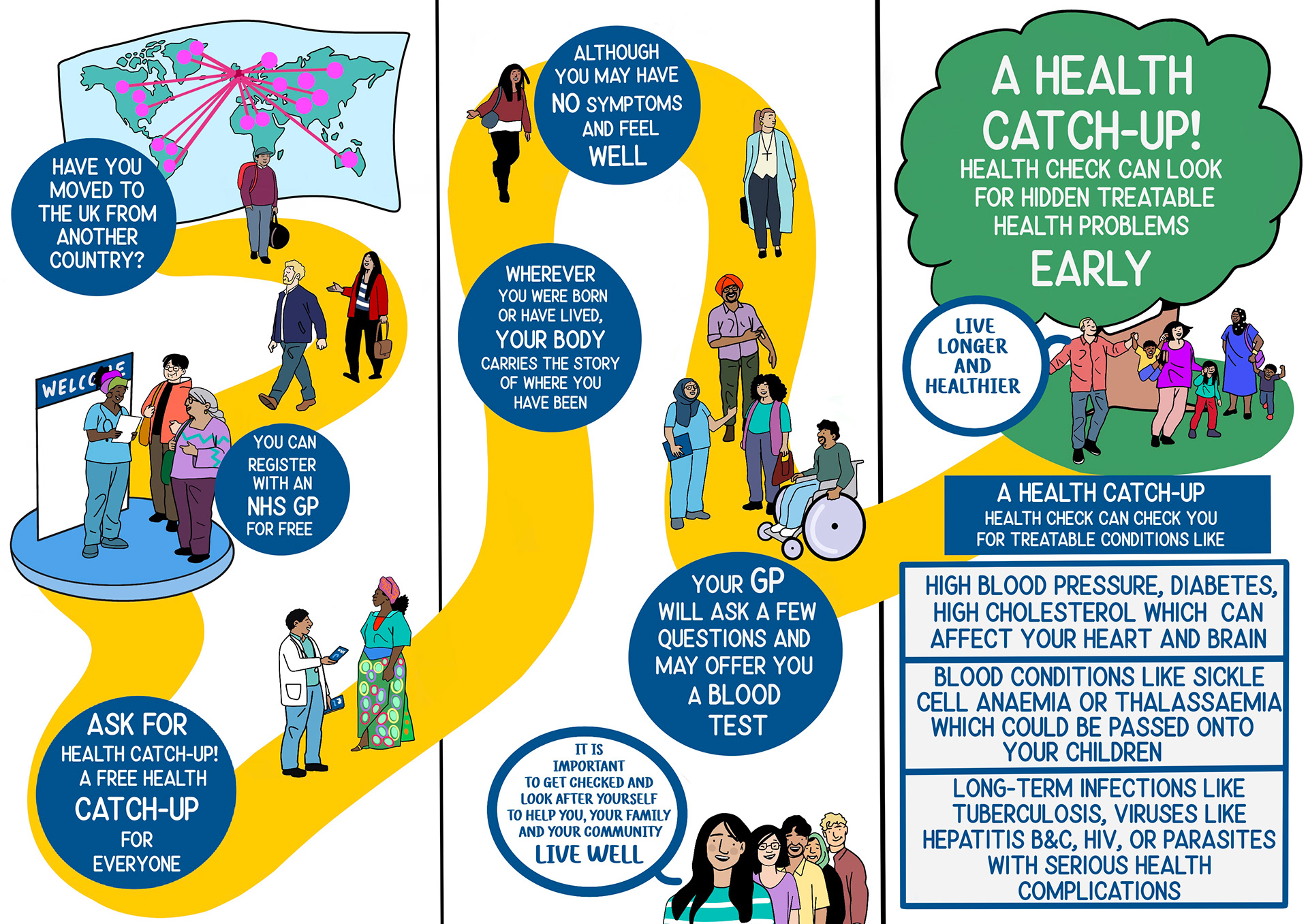
The Problem
The NHS reached out to me to design and produce an animated explainer video, using established NHS house branding, to encourage newcomers to the UK to book into their specialised Health Catch-Up! GP service. This was right up my alley, as I love to break down complex information into fun visuals!
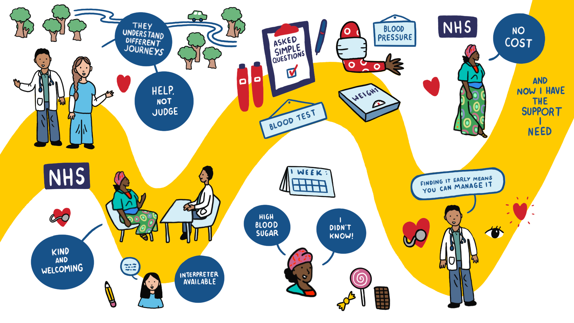
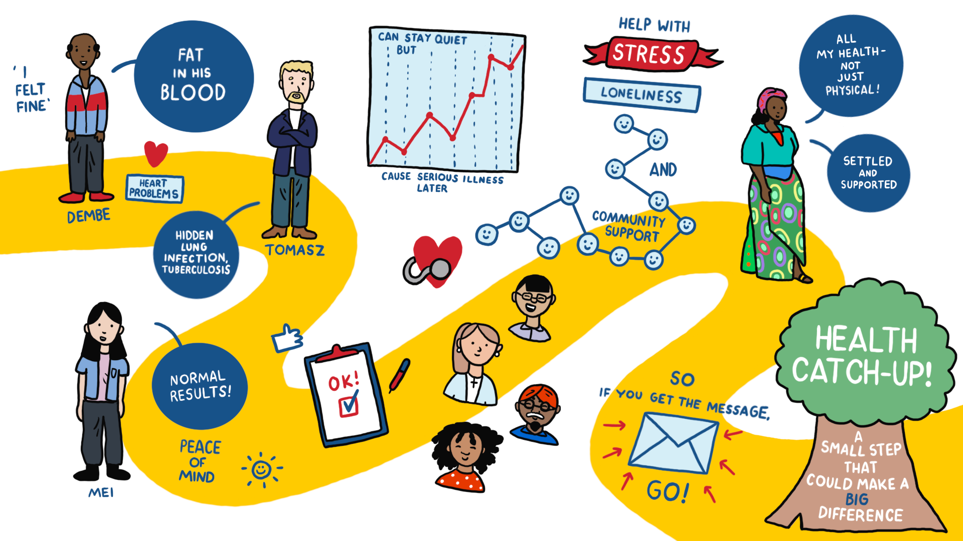
Using UX methodologies such as audience analysis, content structuring, and iterative visual design, I strived to create an accessible and enjoyable final video. Working within the NHS research team, I found that existing pain points for users were as follows:
- They didn't feel sick, so they felt no need to get a GP check up
- The booking system was complex and confusing
- They didn't know the check up service existed at all
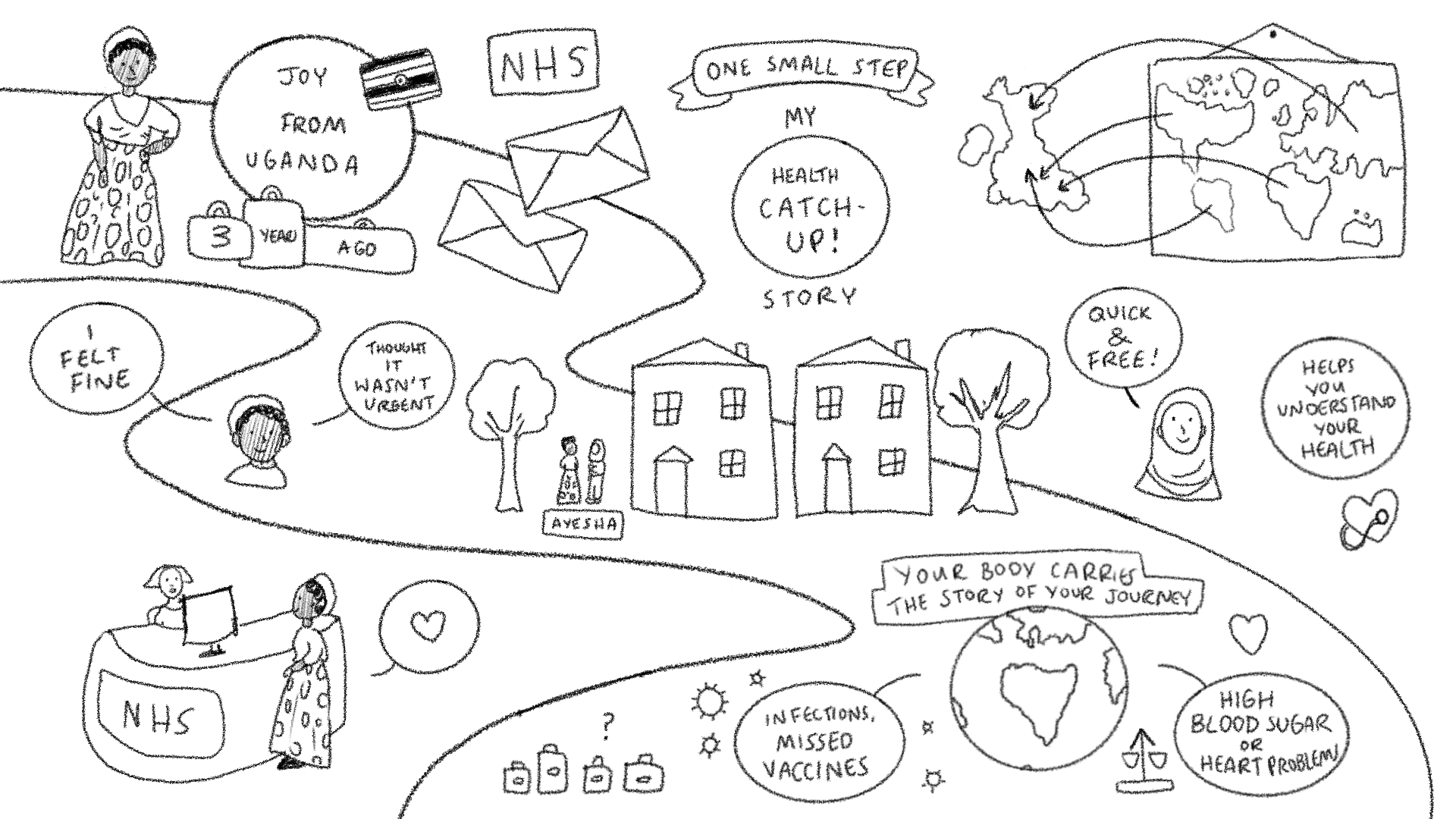
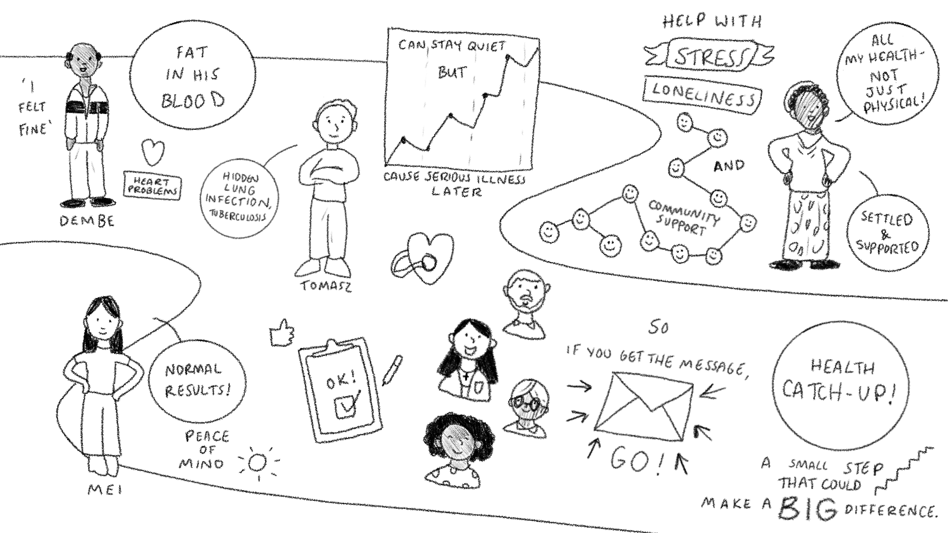
This was where I came in - I collated their research to produce a visually engaging educational video, using real testimonials from new arrivals to the UK like Joy, from Uganda. Check out some screenshots from my video here!
Design Process - What Worked? What Didn't?
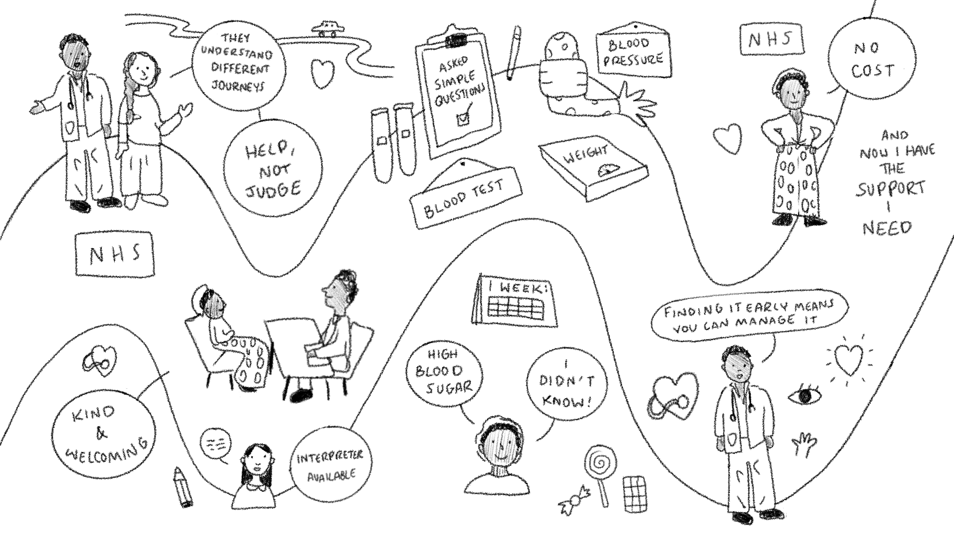
Due to the rigidity of NHS style guidelines, this project went through numerous iterations to get it quite right! During the development stage, the feedback I got from the research team was that they wanted it to match their other branding visuals, and not to be too cartoony. This was a challenge, since the previous visuals had been set by another artist, and used a hand-drawn font, which I would have to emulate.
The font was perhaps my biggest challenge; I could not download or use a font, since it had been hand lettered by a previous artist, so I traced key letters and words, such as 'Health', 'Blood', 'UK' and 'Catch-Up', using these to inform my own designs and make sure they were a close match. I consulted with the research team with every iteration of the project, receiving feedback at each stage.
I also reduced the size of the yellow path in my designs, as feedback suggested that it was overpowering, and did not match the original designs. Check out the original branding I was working alongside, as well as a couple of my own rough sketches:
Results and Feedback
The final project was incredibly well received by the research team, who commended the quick changes I was able to make to the designs! This project featured minimal text, so as to be translatable into multiple languages for new arrivals to the UK. Balancing the minimalistic text style with also being usable and informative was a challenge, but one I enjoyed immensely.
Working within an iterative team on this creative project allowed me to translate complex healthcare information into clear, user-centred visual narratives to improve accessibility and engagement. By focusing on information hierarchy, visual clarity, and user engagement, I was able to ensure that complex medical content was easily understood by diverse audiences.
Upon reflection, if I were to do this project again I would ask for a rigid style guide in advance, including lettering samples, so that I would be able to dive right in with their house style and visuals!