The Problem
While Glasgow Life provides a centralised website, individual Glasgow libraries lack dedicated digital spaces despite offering distinct events and services; I found that this creates a gap in how users discover and engage with what each library offers. I wanted to create a standalone web experience for the Mitchell library to remedy this.
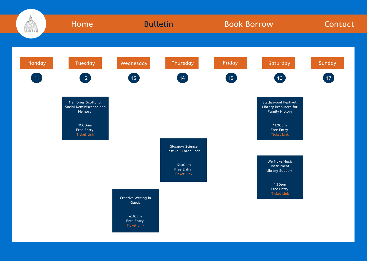
Something I really wanted to feature was a digital version of the in person bulletin board they have at the library on entry. This physical board currently serves as a key touchpoint for event discovery, and I wanted to make sure to include it in my site!
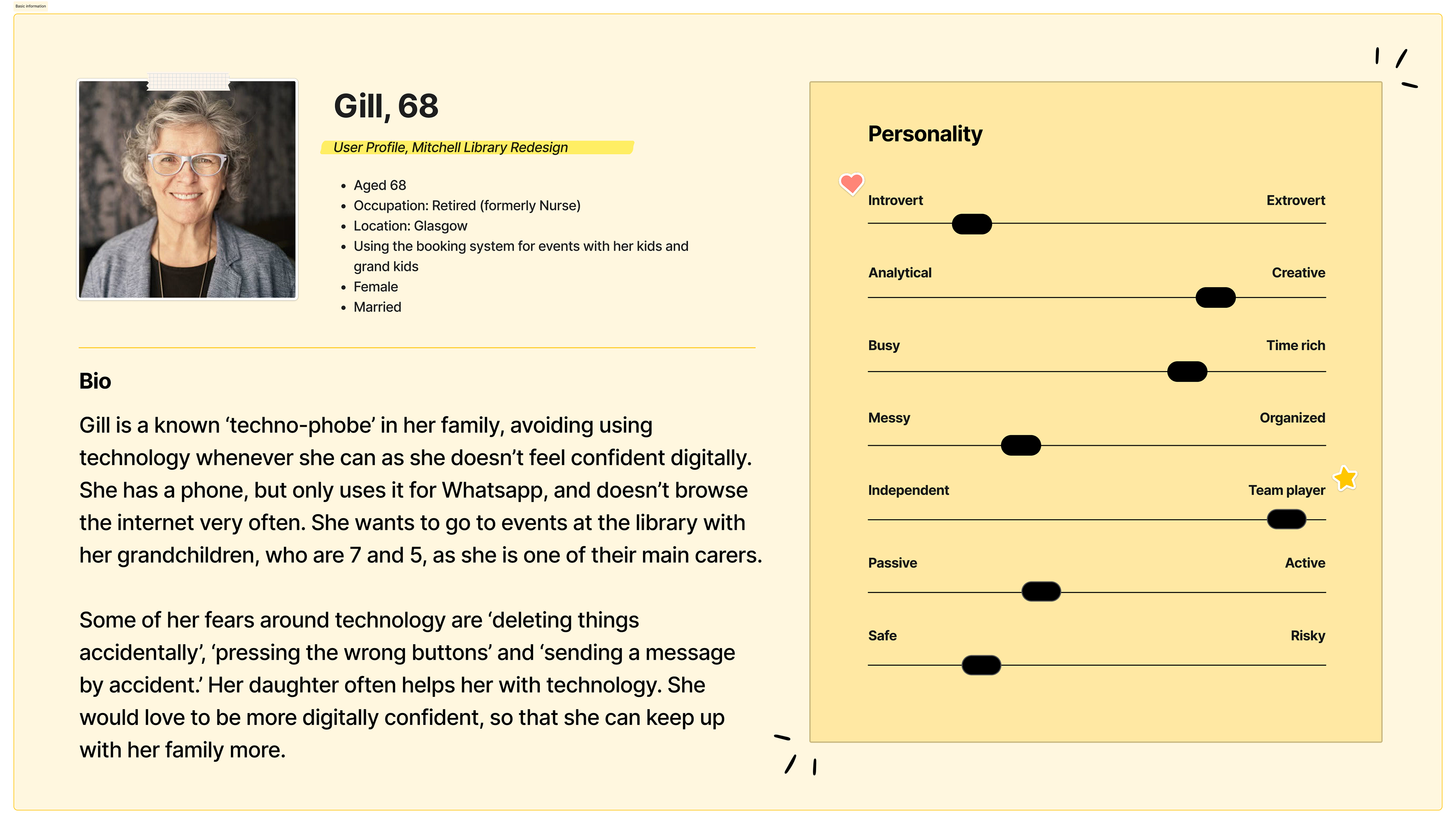
The goal was to translate this familiar, accessible experience into a digital format, making events easier to find and engage with online. I focused my research on users aged 60+, particularly those with lower digital confidence. These users often feel overwhelmed by complex interfaces but still want to participate in community events and access library services.
Success for this project would be defined as enabling users to discover and book an event independently, in as few steps as possible, without confusion or assistance. Check out my user persona representing this audience, outlined below!
My Design Process
I set out to design a clean, accessible web experience aligned with WCAG principles, with a particular focus on supporting older users with low digital confidence. To ground the project in reality, I conducted an on-site visit, documenting current events and how they are communicated in the physical space.
These included community-led activities such as zine-making workshops, health support groups, and children’s play sessions, many of which were prominently displayed in the library but much more difficult to pin down online. I identified a key gap: event information was buried within the broader Glasgow Life website, making discovery and engagement unnecessarily complex!
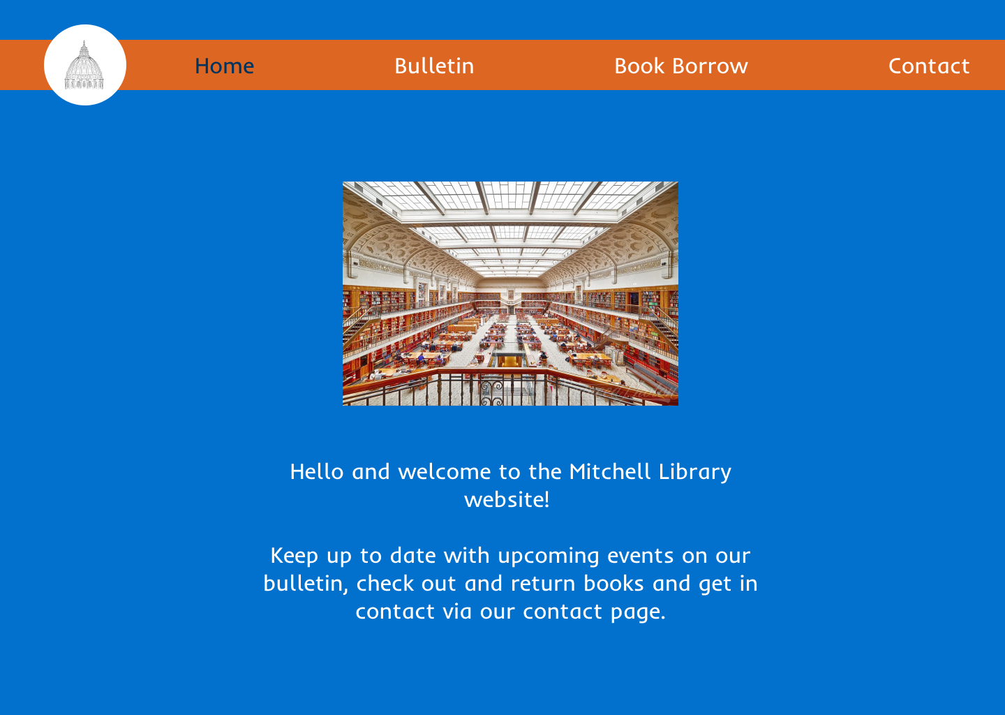
In response, I designed a simplified digital experience centred around a clear information hierarchy and a familiar “digital bulletin board” concept. This approach aimed to mirror the intuitive, in-person experience of discovering events, while making it easier for users to browse, understand, and take action online.
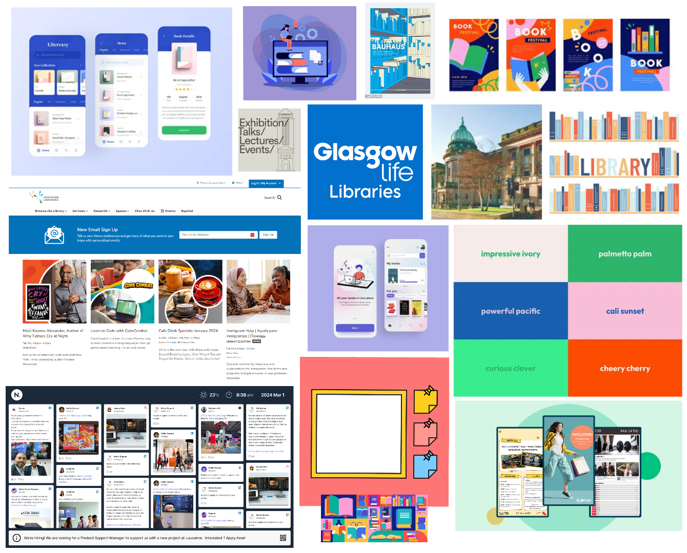
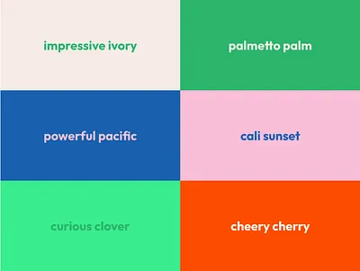
Visually, I explored a balance between approachability and professionalism, using a bright, modern colour palette that aligns with existing branding while prioritising warmth, clarity and readability.
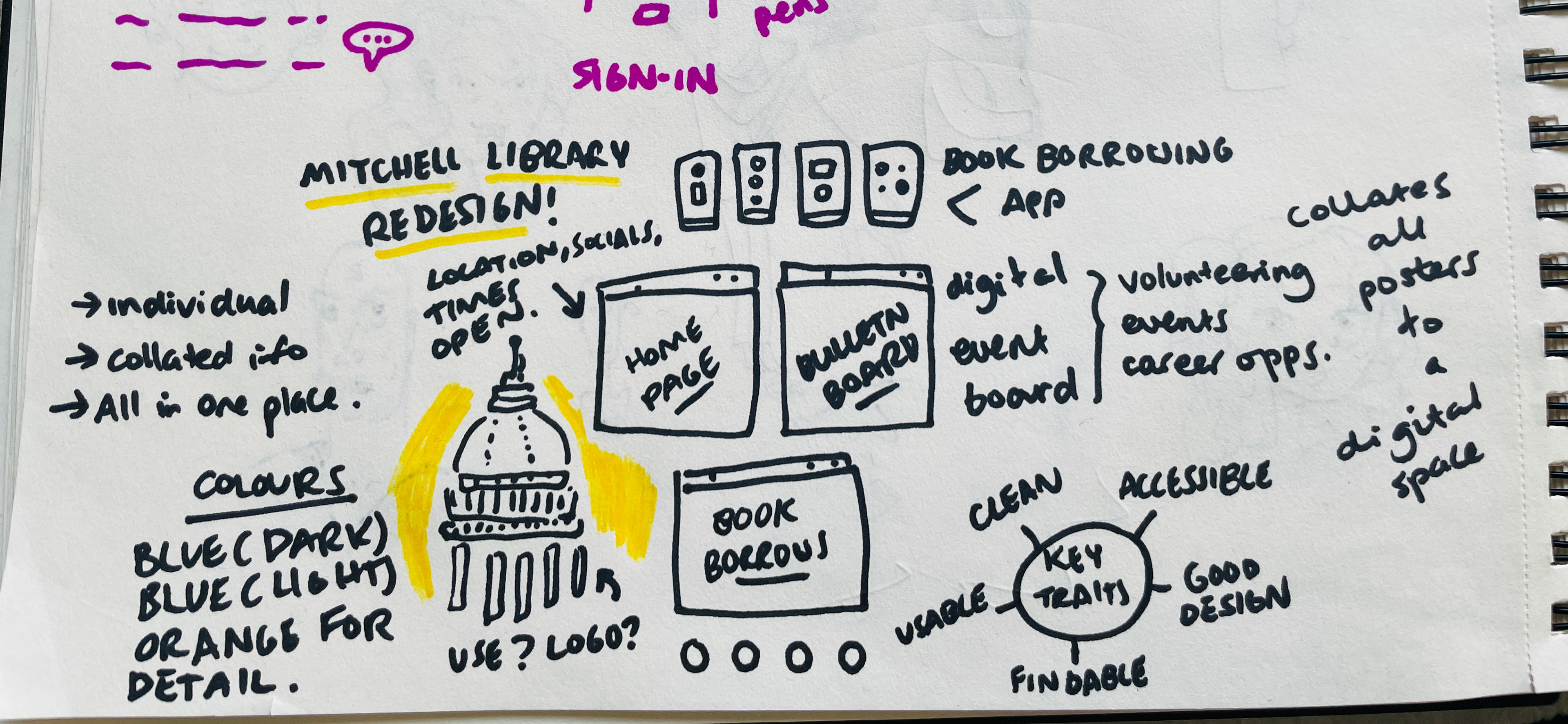
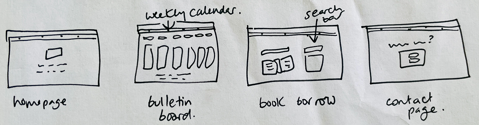
Early concepts and visual direction are shown in the sketches and mood boards below - check them out here!
Design Strategy and Vision - What Worked? What Didn't?
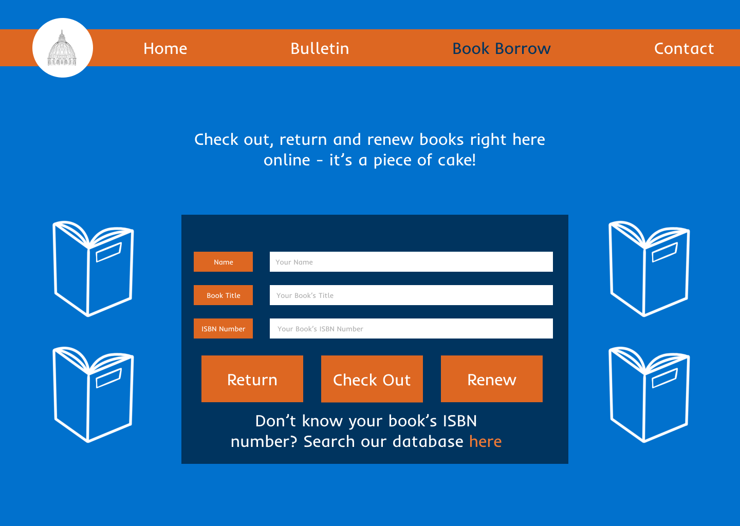
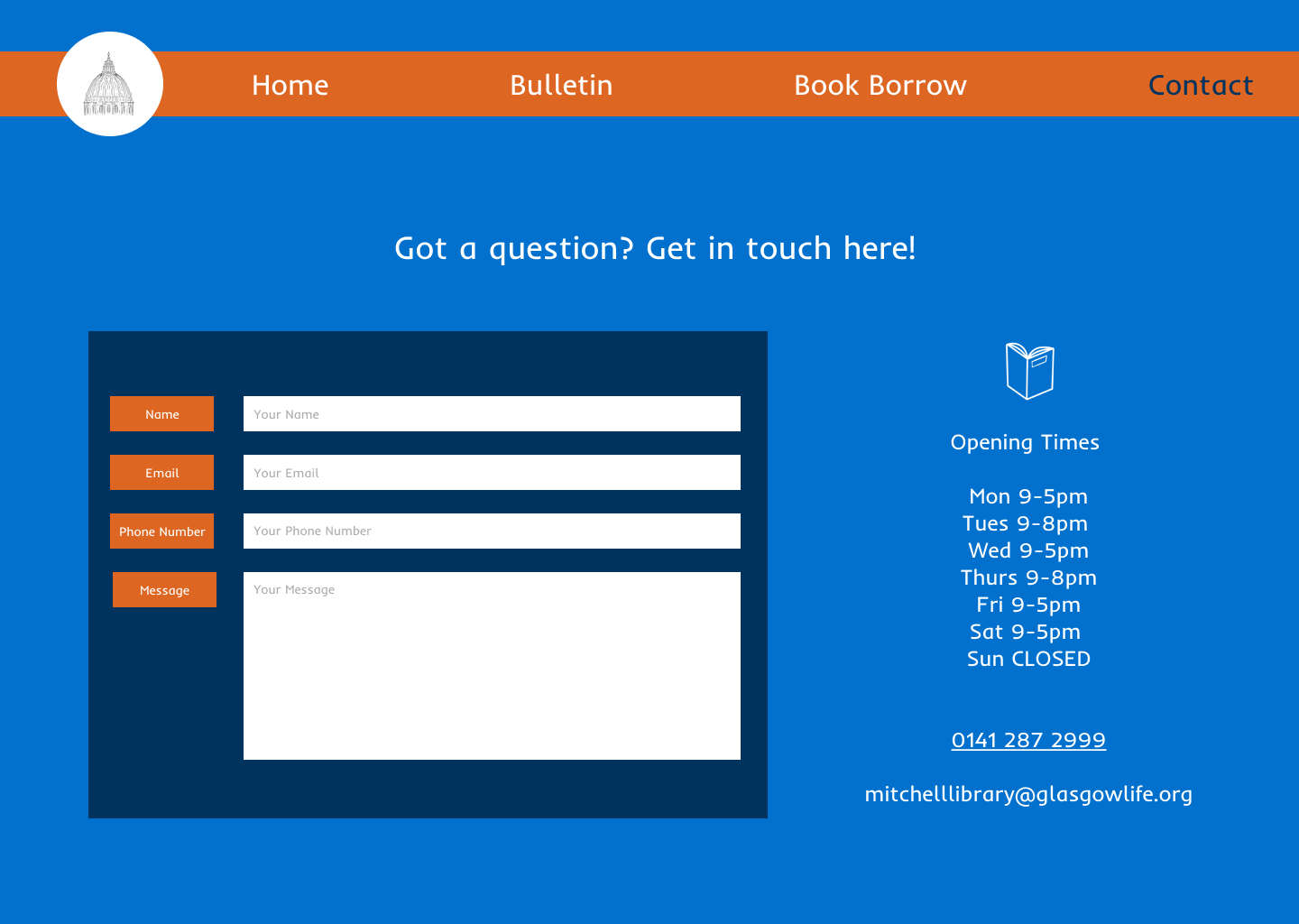
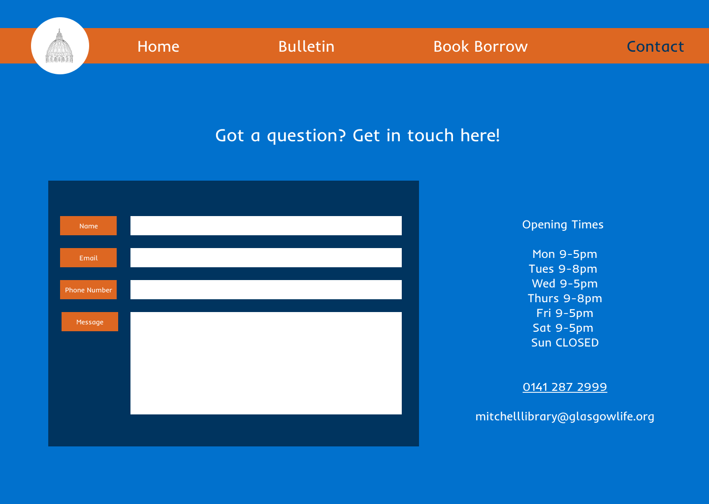
High contrast colours, readable fonts and clear visual hierarchy were important factors for me to prioritise for this project; I wanted my users to feel confident navigating each page. I wanted to keep the number of pages to as few as possible, so as not to overwhelm the user, so decided that four would be the best amount.
The bulletin board layout gave me pause for thought - more realistic cork board designs seemed difficult to parse, and I knew I wanted there to be a calendar aspect as well to the board, to make it really clear when these events were happening too.
Based on feedback from my focus group, I was reminded to check my contrasting colours, such as the colours used in the bulletin announcements, against WCAG accessibility checks. They also advised adding some grey placeholder input text, which I also implemented. This really helped me get into the accessibility mindset, and think about inclusion for users with colour blindness as well as older users!
I also wanted to account for situational barriers, such as using an old phone, or slow internet connection. I decided on blue and orange as my two major colours, as these are complimentary colours, easily readable for older users and ideal for users who are colour blind. Playing into Irn Bru Scottish branding was an added bonus! Check out my early designs below.

Results and Conclusion
I found this project taught me so much about accessibility in design, and how to implement it through my UI - though I had a colour scheme in mind, I had to consistently modify this throughout every iteration to make sure my design had a practical usability too. User responses for the project were very positive, and feedback suggested the users found the site bright and easy to navigate.
For future projects, I'll definitely be taking into account text size for older users, as well as making sure my colours meet WCAG guidelines, to ensure my UI remains usable for a wide audience.